DR.HC COSMETICS
B2B Platform for Private Label of Eco-Beauty


RESPONSIVE WEB DESIGN
MY ROLE
- Product Designer
- Project Lead
TEAM
CEO
Data Analysts
Developers
Designer
TIMELINE
Nov 2023 (8 weeks)
TOOLS


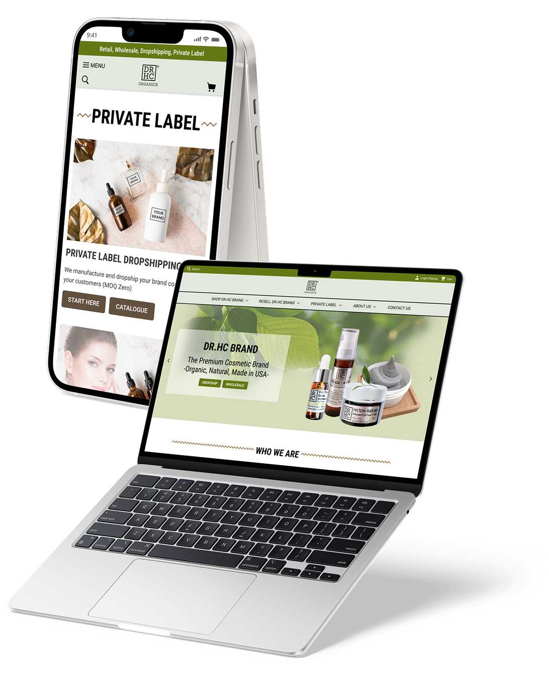
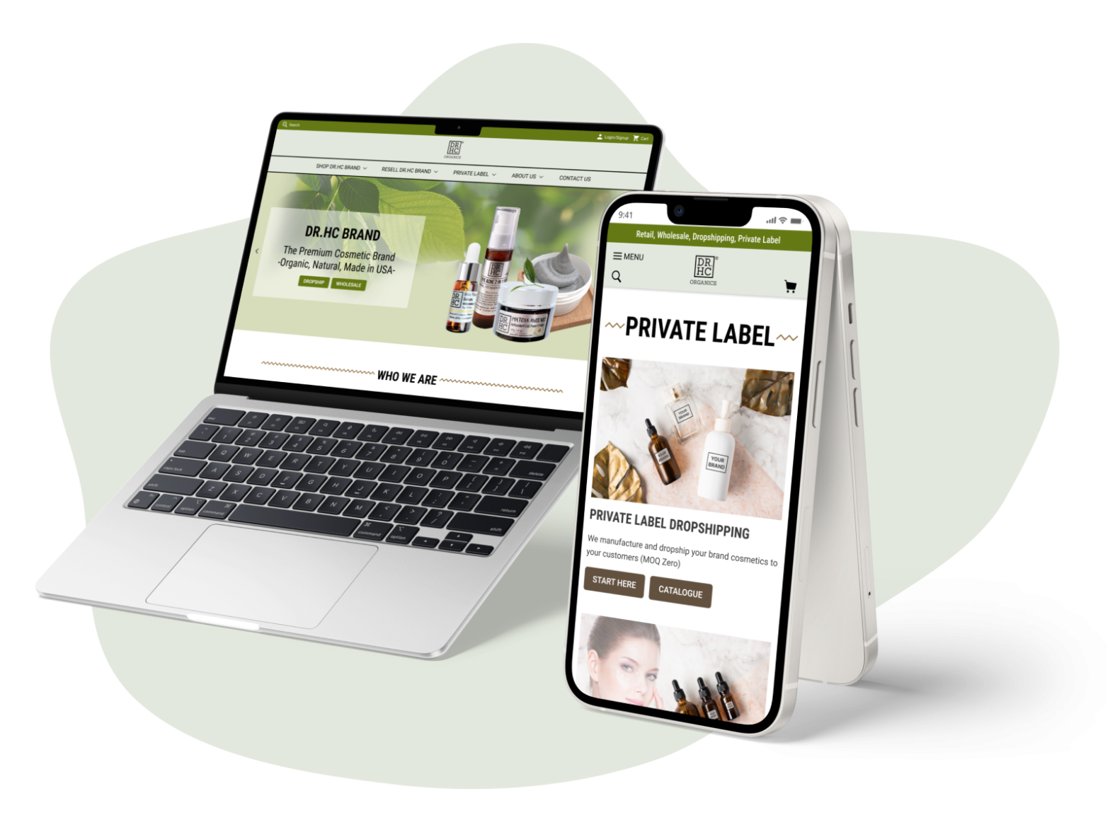
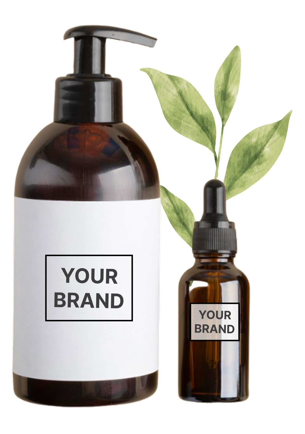
DR.HC Cosmetic Lab is a B2C and B2B cosmetic manufacturer in California that owns the DR.HC (Dr. Happy Choices) organic cosmetic brand and provides private label (PL) services, helping businesses and startups create their own cosmetic brands. As demand for private label services grew, the company recognized the need to redesign its website. This case study aimed to boost private label service visibility and client engagement across devices.

150%
increase in traffic
65%
growth in SQL
30%
time savings in customer service

MY ROLE
MY CONTRIBUTIONS
Project Lead, Research, UX Design, and UI Design
I was the project lead participating in all activities, end-to-end, from immersion to delivery, with a focus on Research, Interaction design, UI design, and User Testing. This redesign project was a collaborative effort between me, DR.HC Cosmetic Lab LLC’s stakeholders, data analysts, and outsourced engineers.
My challenge was to redesign the most visited pages and sections and introduce a new section, including:
- Main Navigation & Footer
- Home Page
- Product Page
- Contact Page
- A new Helpdesk section
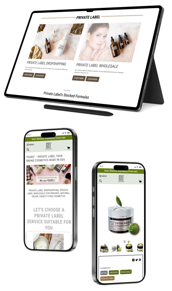
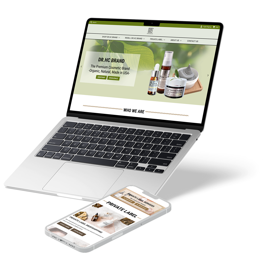
This redesign was implemented for both desktop and mobile-responsive versions, totally 11 pages & sections, incorporating necessary improvements to ensure the final designs aligned with user expectations and enhanced overall user satisfaction.

UX/UI Design Lead
- Competitor Analysis
- User Research Survey
- Screener Survey
- User Interviews
- Affinity Mapping
- Persona
- User Journey Map
- “How Might We”
- User Stories/ Story Mapping
- Information Architecture
- User Flow
- Sketches
- Guerilla Testing
- Preference Testing
- Wireframes
- UI Style Guide
- High-fidelity mockups
- Interactive Prototype
- Usability Testing
- A/B Testing

Cross-functional Collaboration
- Stakeholders Interview
- Stakeholder Management (expectation clarification, effective communication strategy, and involvement in decision-making)
- Internal Experts Interview (data analyst, customer service)
- Design Hand-off to developers
THE PROBLEM
THE BACKGROUND & GOALS
A shift in business focus led to the emergence of new target users and the need for a website redesign.
DR.HC was originally known as a cosmetic brand specializing in Organic and Eco-friendly beauty products. In 2020, the company launched its private label services, which quickly became successful—ranking #1 on Google search within just 3 months and maintaining the top position for 5 consecutive years (this is another project I was responsible for and I’m proud of). However, with this shift in business focus, the company’s website was no longer well-suited for business owners, who had become one of the primary target users.
The user research I conducted revealed that the following pages and sections retained the most user interest upon landing on the website: 1/Main Navigation & Footer, 2/ Home Page, 3/ Product Page, and 4/Contact Page – these were defined as the project’s scope. However, the research also uncovered key patterns indicating that users struggled to navigate the private label services, leading to a high bounce rate of 35% on the homepage. This aligned with the insights from Attention Heatmaps (Eye-Tracking, Mouse-Tracking, and Scroll Heatmaps) collected from data analysis.
Given these insights, redesigning the most visited pages and sections to better showcase private label services and help business clients (the new target users) easily find and engage with them became a critical goal and challenge. This project aimed at enhancing the experience for business owners seeking private label services while ensuring the overall design remains user-friendly for retail customers purchasing DR.HC brand products.
Users scrolled through the entire Home Page and then exited (resulting in a high bounce rate of 35%).

Users navigated from the Home Page to a Product Page but then either exited or moved to the Contact Page.

Users went back and forth before clicking on the Contact Page. Customer Service frequently received inquiries about whether private label services were available.

Users spent significant time on the Main Navigation, clicking back and forth, before finally locating the Private Label Services menu.

THE PROBLEMS
How might we help users easily notice and engage with the Private Label services by redesigning the most visited pages & sections?
The user research I conducted revealed 4 key insights about how our target users (business owners) interact with our website:
- Users were confused about whether we offer private label services.
- Users wanted to quickly scan product values to ensure they aligned with their niche (organic, vegan, eco-friendly, etc.).
- Users wanted to assess our services’ trustworthiness.
- Users could not easily access the service detail pages to learn more and sign up.
Therefore, when redesigning the DR.HC website, I focused on addressing 4 key challenges related to those specific insights:
01
Visibility
How might we help users quickly notice that we offer Private Label services?
02
Values
How might we help users easily understand our product values?
03
Trustworthiness
How might we make users feel confident that our services are attractive and trustworthy?
04
Seamless Access
How might we enable users to quickly access the service detail page to engage further?
THE SOLUTION
Want to explore my Design Process first?
MY SOLUTIONS
Help users Easily Notice and Confidently Engage with the private label services
I focused on enhancing the user experience by addressing the 4 key challenges mentioned above within the project’s scope.
01
Main Navigation & Footer
PROBLEMS:
How might we
- improve the visibility of the PL services
- enable users to quickly understand our values
- increase our trustworthiness
- provide quick access to the PL service details?
SOLUTIONS:

02
Home Page
PROBLEMS:
How might we
- improve the visibility of the PL services
- enable users to quickly understand our values
- increase our trustworthiness
- provide quick access to the PL service details?
SOLUTIONS:

03
Product Page
PROBLEMS:
How might we
- improve the visibility of the PL services
- enable users to quickly understand our values
- increase our trustworthiness
- provide quick access to the PL service details?
SOLUTIONS:

04
Contact Page
PROBLEMS:
How might we
- improve the visibility of the PL services
- enable users to quickly understand our values
- increase our trustworthiness
- provide quick access to the PL service details?
SOLUTIONS:

05
Helpdesk
PROBLEMS:
It was my idea to introduce a new Helpdesk feature after research revealed that users frequently contacted customer service regarding Private Label services. On the Helpdesk, I worked to resolve these problems:
How might we
- improve the visibility of the PL services?
- provide quick access to the PL service details?
SOLUTIONS:

INTERACTIVE PROTOTYPE
Let’s try the interactive prototypes to get a real feel for my redesigned product
DESIGN PROCESS
Want to jump right into my Design Solutions?
Here’s how I developed the design solutions mentioned above…
Click the tabs below for details of my design process.
THE METHODOLOGY
USER-CENTER DESIGN & DESIGN THINKING
THE METHODOLOGY
Combining User-Center Design Process with Design Thinking Mindset
To successfully complete this project, I integrated the Design Thinking mindset into the User-Centered Design (UCD) process, creating a comprehensive and in-depth approach.
CLICK HERE TO VIEW DETAILS OF MY METHODOLOGY
After defining the project scope, I dedicated the first three weeks to conducting user research to better understand the target audience, identify their pain points and needs when visiting the DR.HC website, and analyze the findings to extract actionable insights. These insights guided me in defining key problems and generating innovative solutions. The prototype underwent two rounds of testing before the final designs were completed. Throughout the design process, I frequently revisited the empathy phase to deepen my understanding of users and ensure informed, user-driven design decisions.

KICK-OFF!
STAKEHOLDERS & INTERNAL EXPERTS INTERVIEW
STAKEHOLDERS & EXPERT INTERVIEWS
Interviewed the stakeholders and experts to identify the problem space, project scope and goals.
To kick off the project, I interviewed the stakeholders & data analysts to clarify the target audiences, the problem space, the project goals, timeline, and scope.
Target Users:
- New website visitors
- Business owners looking to create their own organic, vegan, and eco-friendly cosmetic brands.
Business Goal:
- Increase sales performance by helping the target users easily notice and engage in the private label services.
Project Scope:
- Research
- Redesign: 1/Main Navigation & Footer, 2/ Home, 3/ Product Page, 4/Contact Page (Data analysis revealed that these pages and sections retained the most user interest upon landing on the website)
- Test & Iterations
Timeline:
- 8 weeks
Problems uncovered from Data Analysis:
Attention Heatmaps (Eye-Tracking, Mouse-Tracking, and Scroll Heatmaps) uncovered key patterns indicating that users struggled to navigate the private label services:
Users scrolled through the entire Home Page and then exited (resulting in a high bounce rate of 35%)
Users navigated from the Home Page to a Product Page but then either exited or moved to the Contact Page.
Users went back and forth on the Home Page before clicking on the Contact Page.
Users spent significant time on the Main Navigation, clicking back and forth, before finally locating the Private Label Services menu.
UNDERSTAND THE PROBLEM
COMPETITOR ANALYSIS
COMPETITOR ANALYSIS
Identified other suppliers’ strengths & weaknesses
I spent some time researching other websites to understand what competitors in the market are offering.
I used Chat GPT and Google Search to find the most popular companies providing private-label services for organic cosmetics in the USA and conducted a competitor analysis on GreenDropship, Blanka, Via Glamour, and Jubilee. While GreenDropship specializes in organic and eco-friendly products similar to DR.HC, Blanka, Via Glamour, and Jubilee were not exclusively organic but stood out as user-friendly platforms with a strong reputation in the industry.

I analyzed their unique features, missing or weak points, design strengths, and design flaws to identify what to avoid and gain inspiration from standout designs and features that could be implemented in this project. Among them, Blanka and Via Glamour were the most inspiring to me from a design perspective.

UNDERSTAND THE USERS
USER RESEARCH SURVEY, SCREENER SURVEY, USER INTERVIEWS, AFFINITY MAP, PERSONA, USER JOURNEY MAP
USER RESEARCH SURVEY
Gathered quantitative data on how easily users could access the private label services.
METHODS & GOALS:
I conducted a user research survey to gather quantitative data on how easily users can access our private label services. The survey was conducted via Google Forms with 65 participants, who were recruited directly through a popup on the company website.
Participant characteristics:
- Visiting our website to start a business with us (not to make a retail purchase)
- A new visitor to our website.
INSIGHTS:
What surprised me was the extremely high percentage of participants who did not notice that we offer private label services when they first landed on our website. These findings align with the data I gathered from analysts, which highlighted how difficult it was for potential clients to navigate our website for Private Label services—explaining the high bounce rate and the high volume of customer service inquiries.
USER AWARENESS OF PRIVATE LABEL SERVICES ON HOMEPAGE

- 58% of users who visited our homepage for the first time to start a private label business were unsure whether we offer private label services.
- 37% took some time to notice our PL services
- Only 2% said they found the services quickly.
USER RESPONSES WHEN UNSURE ABOUT THE PL SERVICES

- 62% said they would contact support
- 31% indicated they would likely leave the website.
SCREENER SURVEY & USER INTERVIEWS
Screener Survey – recruiting relevant interviewees
I then conducted user interviews to gain a deeper understanding of the pain points and needs of the target users.
It was crucial to interview individuals who could be potential clients of the private label service, as their insights would help me gather valuable data about user needs. To ensure I selected the most relevant participants, I conducted a screener survey targeting business owners interested in creating their own organic, vegan, or cruelty-free cosmetic brands but who had not yet joined our private label program.
Participants were recruited through our newsletter subscriber list.
User Interviews – uncovering my users’ pain points and needs!
METHOD:
I conducted user interviews with 5 participants and asked them 28 questions covering various aspects. Noticing that it seemed difficult for users to navigate the PL services on our website, I focused my questions on their needs and expectations when looking for a PL supplier, their pain points when exploring our website to find PL services, and their motivations to engage with the services. I also gathered information about other suppliers they are currently considering, as well as their budgets and preferences, to gain a broader and deeper understanding of their overall experiences.
KEY INSIGHTS:
One of the results that surprised me the most was that 5 out of 5 users revealed they wanted to see that the company offers Private Label services at a glance when navigating the Main Menu and the Homepage. This indicated that the current website was not clear in communicating to users that we offer those services.
The findings align with the insights from the User Research Surveys and the data collected by the data analysts.

AFFINITY MAPPING
Synthesized research data to identify actionable key points.
I then proceeded to analyze the data collected from users through the interviews. To address these issues, I used the Affinity Mapping technique to synthesize the data into actionable insights, which improved my understanding of user needs and pain points and helped me narrow down the problem scope.

The affinity mapping analysis revealed 4 key factors that could alleviate potential clients’ pain points when visiting the current website and encourage engagement with our platform. The results also aligned well with the findings from the User Research Survey:
THE 4 KEY INSIGHTS
Highlights of business owners’ pain points & needs…
Users wanted to
- FIND: Know if we offer private label services.
- UNDERSTAND: Quickly scan the products we offer to determine if the values align with their niche requirements.
- TRUST: Feel confident that our services are attractive and trustworthy.
- ACCESS: Easily navigate to the service detail page to learn more and get started.
By focusing on these areas, we can effectively address the users’ challenges and promote engagement with our platform.
PERSONAS
Business owners who want to create their eco-friendly cosmetic brands, and are new to our website
Based on the results of the user interviews and the analysis from affinity mapping, I used Miro to create a persona representing the target users: business owners who want to create their own organic, vegan, and eco-friendly cosmetic brands, and are new website visitors. I named her Cynthia. Establishing this persona helped me stay focused on the users’ needs and pain points, allowing me to think from their perspective throughout the design process.

USER JOURNEY MAP
Mapping the end-to-end experience users will have when visiting DR.HC website.
To help me easily envision potential solutions, I created a map of the possible end-to-end experiences that target users will have when visiting the DR.HC website. The user journey map helped me focus on the most critical aspects of the user experience that I wanted to improve.

PROBLEM STATEMENTS
HOW MIGHT WE QUESTIONS
HOW MIGHT WE…?
How might we help users easily notice and engage with the Private Label services?
To address the main question, I concentrated on the most critical aspects of the user experience identified through research data analysis and organized the problems into 4 themes:
01
Visibility
How might we help users quickly notice that we offer Private Label services?
02
Values
How might we help users easily understand our product values?
03
Trustworthiness
How might we make users feel confident that our services are attractive and trustworthy?
04
Accessibility
How might we enable users to quickly access the service detail page to engage further?
INITIAL IDEATIONS
USER STORIES, STORY MAPPING, SITE MAP, USER FLOW
USER STORIES
Brainstormed how my users would use the website to find and engage with the PL services.
I started generating ideas by utilizing divergent thinking techniques to create user stories, which demonstrate how my users would navigate the target pages or sections of the website to reach their goals.
I asked myself these key questions: What do users want to do when landing on the Home Page, Product Page, or Contact Page, or when navigating the Main Menu or Footer? What information do they want to see, and what actions do they need to take in order to engage with our Private Label services?
This process helps me better understand my users’ behaviors, always keeping them at the center of my designs.

USER STORY MAPPING
Determined the most crucial user stories to include in the target pages & sections
I prioritized all the stories in the User Stories list based on how much they helped users meet their main needs and resolve their pain points, which were identified during the user research phase. I then created a User Story Mapping to highlight the most crucial user stories that should be prioritized for inclusion in the target pages/sections, as they most effectively address the identified problems. This User Story Mapping served as an essential reference, ensuring that my designs consistently centered around the users.

SITEMAP
Determined the most crucial user stories to include in the target pages & sections
Through user interviews, 5 out of 5 users revealed that they wanted to easily see the company’s Private Label services when navigating the main menu. As a result, I decided to add “Private Label” as one of the top-level menu items in the main navigation.
Additionally, since the company offers services related to its own brand, DR.HC, I also added that option to the first level of the main navigation. This ensures that my designs meet the design constraints: showcasing the Private Label services while keeping the design user-friendly for visitors interested in the DR.HC brand.
I created a detailed sitemap to reflect these changes, which will serve as a guide for designing the user flows in the next step and redesigning the website’s main navigation.

USER FLOW FOR THE RED ROUTES
Visualized step-by-step how users navigate through the target pages/sections to find the private label services they needed.
I combined the key user stories into the sitemap and developed a user flow to depict the main routes users take through the target pages and sections I worked on in this project to reach their goals. The user flow helped visualize the major actions users take step-by-step when navigating the website to find the private label services, and served as an essential reference for me to ideate solutions.

SKETCHING & INITIAL VALIDATION
SKETCHES, GUERILLA TESTING, PREFERENCE TESTING
SKETCHES
Developed sketches as lightweight, low-fidelity representations of the new designs
Now came the fun part! After mapping out user actions on each page and section through the User Flow, I began creating hand-drawn sketches, integrating my solutions to enhance the user experience wherever possible throughout the journey.
For the Main Navigation, Footer, and Home Page, I developed multiple sketch variations.
During sketching, I constantly asked myself: “How can we help users easily notice the PL service, understand the value we offer, perceive our services as attractive and trustworthy, and quickly access service details?”. This mindset ensured that users remained at the center of my designs.
My sketches encompassed the 5 pages and sections I was working on (desktop version)

GUERILLA TESTING & PREFERENCE TESTING
Validated My Initial Ideas
I then conducted a quick guerrilla preference testing with 7 users, asking them to vote for the most optimal designs of the pages/sections that had multiple sketch variants. Additionally, I had them complete several tasks to quickly validate whether the initial designs worked.
Based on their voting, I decided on the most potential design versions. Overall, they liked my ideas, aside from some minor issues, such as some text fields being left blank, which made them take extra time to guess their meaning or required additional explanations. Thankfully, all participants had no trouble interacting with the sketches and successfully completed the given tasks.
WIREFRAMING
WIREFRAMES
WIREFRAMES
Established the foundation design with detailed UI elements
Once the sketches were finalized without any issues, I proceeded to create high-fidelity wireframes in Figma for both the desktop and responsive mobile versions. These wireframes featured precise layouts, consistent components, and more detailed content and functionalities. They effectively conveyed my solutions and established a strong foundation for the design, enabling me to develop visually polished high-fidelity mockups in the next step.
HOME PAGE, PRODUCT PAGE, CONTACT PAGE

MAIN NAVIGATION, FOOTER, HELPDESK

DESIGN SYSTEM
UI STYLE GUIDE FOR DESKTOP & MOBILE
UI STYLE GUIDE
Recreated the UI Style Guide to convey the brand’s tone and mood: Natural, Earthy, Comforting, and Trustworthy.
In this redesign project, besides developing solutions to enhance the user experience—helping users easily find and engage with PL services—I also created new component sets for both the desktop and responsive mobile site to accommodate the design updates. Additionally, I revised the UI Style Guide to align with the new changes.
To reflect the brand’s visual concepts, my primary improvements focused on the color palette and font sizes, ensuring a clearer hierarchy and enhancing the visibility of PL services through consistent color usage. I also prioritized a clean and highly readable interface while maintaining the brand’s core attributes: Natural, Earthy, Comforting, and Trustworthy.
VIEW MY JUSTIFICATIONS FOR THE VISUAL DESIGN DECISIONS WHEN DEVELOPING THE UI STYLE GUIDE
TYPOGRAPHY:
- I retained the Roboto Condensed font for headings and the Roboto font for body text. This combination creates a harmonious and balanced tone for a natural cosmetics website—modern, clean, yet approachable and trustworthy. These well-designed, balanced fonts inspire confidence in the brand’s commitment to quality and safety.
COLOR PALETTE:
- I chose #647914 (a dark, muted green hue with a yellowish undertone) as the primary color, representing the DR.HC brand; #926F40 (a medium brown shade) to represent the private label services; and #635140 (a muted, dark brown hue) for buttons. These shades evoke a natural, earthy feel while making visitors feel comfortable and confident in the purity and safety of the products.
- To complement these colors, I paired them with soft, warm, light backgrounds: #E3E8DE (a light, desaturated green with subtle gray undertones) for content related to the DR.HC brand, #F5E5E1 for private label services, and #F5F5F5 or white (#FFFFFF) for shared areas. These background choices enhance feelings of nature, calmness, cleanliness, and trustworthiness.
- Dark gray shades were used for text, ensuring readability. The text was tested and met WCAG AA and AAA accessibility standards, meaning it provides sufficient contrast against the backgrounds for readability and accessibility.
The final UI Style Guide

HIGH-FIDELITY MOCKUPS
HIGH-FIDELITY SCREENS
HIGH-FIDELITY SCREENS
Transformed my solutions into stunning digital interfaces.
I then moved on to creating high-fidelity screens for the desktop and responsive mobile versions, based on the detailed wireframes and the UI Style Guide. For each page or section I worked on, I kept the users’ pain points and needs in mind, ensuring that the design addressed the four key challenges:
- Enabling quick access to the service detail pages
- Making the Private Label services easily noticeable
- Clearly communicating our product values
- Ensuring that our services appear attractive and trustworthy
There was a significant change to the Home Page when transitioning from wireframes to high-fidelity screens...
After creating a high-fidelity screen based on the wireframe structure, I realized that the 3 main sections—Who We Are, DR.HC Brand, and Private Label—were not clearly distinguishable. Each section contained multiple subsections, and the abundance of visual elements and content made them blend together.
To validate this concern, I had quick discussions with a few coworkers to gather their perspectives. While I understood that testing with real target users would be ideal, in this case, the goal was not to evaluate interest in Private Label services but rather to determine whether the site’s hierarchy was clear enough for users to distinguish between sections. I decided to do a quick internal check to see if others shared my observation.
As a result, all three colleagues I consulted preferred a clearer hierarchy. To address this, I incorporated two full-width banners to better differentiate the DR.HC Brand and Private Label sections. This solution was later highly appreciated by stakeholders.


Potential solution and AI constraint
For the new Helpdesk feature, I proposed AI-driven service recommendations and prioritization, similar to Amazon’s product recommendations, to enhance visibility and access. Although AI technology constraints prevented immediate implementation, stakeholders recognized the solution’s potential and earmarked it for future iterations.
PROTOTYPING
INTERACTIVE PROTOTYPE
INTERACTIVE PROTOTYPE
Developed prototypes for desktop and mobile versions
I then proceeded to develop an interactive prototype of the pages and sections I was working on to provide a realistic experience for the participants in the next step of usability testing.
VALIDATION
USABILITY TESTING (2 ROUNDS), ITERATIONS, A/B TESTING
USABILITY TESTING – ROUND 1
Task success rate: 100%, User satisfaction rate: 97% – Minor issues identified.
METHODS & GOALS:
- Moderated usability tests in-person and remotely with 5 participants.
- Participants were our potential clients who were interested in our private label services and sent us inquiry forms to express their interest.
KEY TASKS & QUESTIONS:
I asked them to complete 10 tasks and answer 4 open-ended questions. The primary goal was to validate:
- Whether users could quickly notice our private label services on the landing page
- Whether they found them persuasive enough to learn more about our services
- Whether they could quickly access the service pages.
KEY FINDINGS:
Task success rate
100%
All users were able to notice and access the private label services.
User satisfaction rate
97%
All users were satisfied with how they learned about our values. All expressed a desire to learn more about our services.
Areas for improvement:
- Some took a little longer to navigate the PL services on the Main Menu because they preferred more commonly used terms rather than the jargon “private label” which was unfamiliar to them.
- One user mentioned that it was not easy to recognize that the website offers clean cosmetics, even though it is stated in the text.
ITERATIONS
Modified my designs based on user feedback to further enhance the user experience.
I made these changes for both desktop and mobile versions:
- Changed the menu label from “Private Label” to “Create Your Brand” for more user-friendly wording, especially for new users.
- Added a value banner right below the main sliders to better highlight our product values.


USABILITY TESTING – ROUND 2
Task success rate: 100%, User satisfaction rate: 100%
I conducted a second round of usability testing with 5 different participants, using the same method and key questions/tasks.
KEY FINDINGS:
Task success rate
100%
- 5/5 users were able to quickly notice the private label services.
- 5/5 users were able to easily access the private label services.
User satisfaction rate
100%
- 5/5 users were satisfied with how easily they could learn about our values.
- 5/5 users felt trust and expressed a desire to learn more about our services.
NEXT STEP:
We received a suggestion to explore alternative placements for the running banner, such as a sticky bar at the bottom of the screen. Although we didn’t implement this iteration immediately, I documented it for future design explorations.
Recently, we revisited this project and are now conducting A/B testing to determine the optimal banner position and continuously improve user experience.
THE FINAL PRODUCT
AND HOW IT SOLVED THE PROBLEMS…
DESIGN HAND-OFF
DESIGN HAND-OFF TO DEVELOPERS & STAKEHOLDERS
DESIGN HAND-OFF
The last step…
Once everything is validated, tested, and approved from the stakeholders, I handed off all materials to the stakeholders and developers.
PRODUCT LAUNCH

Now, the most exciting phase: Product launch!
My design was officially adopted in Jan 2024, introducing intuitive navigation, structured content, clear calls to action, compelling visuals, mobile optimization, and a user-centric approach.
These enhancements not only improved the user experience and increased clients’ ability to discover and engage with Private Label services but also delivered tangible business value and strengthened the company’s visibility, reputation, and professionalism.
+150%
increase in traffic to the PL service pages
+65%
growth in sales-qualified leads
30%
time savings in customer service
Satisfaction Voice

THE TAKEAWAY
SUCCESS
Outstanding results with a 150% increase in traffic, a 65% growth in SQL, and 30% time savings in customer service!
- Successfully designed innovative solutions and exceptional interfaces that exceeded stakeholder expectations, all while meeting a tight deadline in a fast-paced environment.
- Achieved outstanding results, including a 150% increase in traffic to the private label service pages, 65% growth in sales-qualified leads, and a significant 30% time savings in customer service.
- The revamped website not only enhanced the user experience and delivered tangible business value but also enhanced the company’s visibility, reputation, and professionalism with its modern and refreshed look.
- The redesign successfully passed usability testing, achieving a 100% Task Success Rate and a 100% User Satisfaction Rate.
- Effectively managed stakeholder relationships
- Effectively fostered multidisciplinary collaboration throughout the project lifecycle.
LEARNINGS
Multi-Functional Collaboration
- Developed strong communication and collaboration skills by working effectively with the stakeholders, developers, data analysts, and customer service to achieve the best results.
- Finding a competitor that operates as both a brand and a private-label supplier was challenging, so I focused on competitors that specialize in private-label. This experience allowed me to learn how to extract and incorporate effective design elements from them into my own designs while maintaining a balance for the website as a cosmetic brand.
NEXT STEPS
If I had additional time…
- I would have included the A/B Testing in the project scope.
- I would have conducted more research, such as heuristic evaluation and card sorting to further enhance the user experience.
- I would have preferred conducting all interviews in person to better understand users’ emotions and feedback. Due to the tight timeline, I conducted user interviews and usability testing both in person and, primarily, remotely.