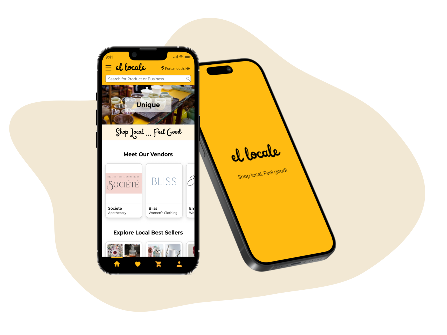
EL LOCALE
Shop Local, Feel Good!

MOBILE APP DESIGN
MY ROLE
- Team Lead
- UX & UI
DESIGN TEAM
Chau Huynh
Alexis Luu
Christopher Richert
Phuong Homuth
TIMELINE
Jan 2025 (4 weeks)
TOOLS


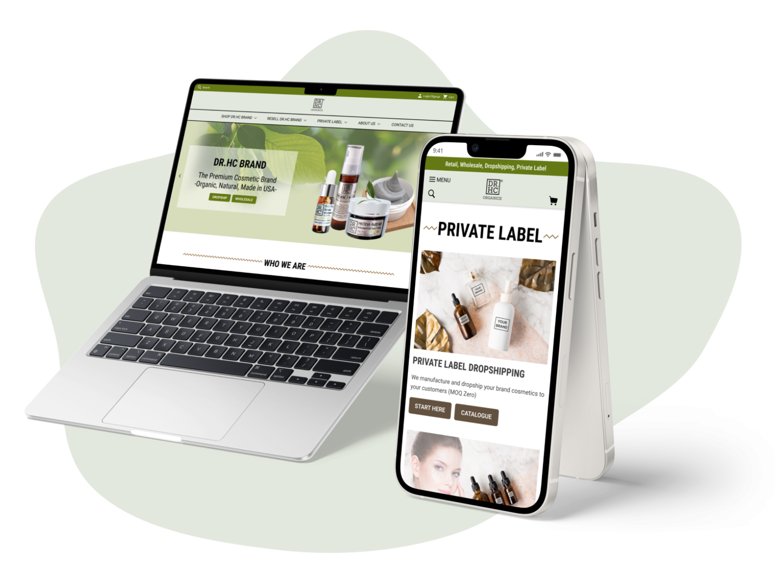
El Locale is a B2C and B2B online community e-commerce platform that facilitates seamless local shopping and supports local businesses by connecting consumers with a curated selection of nearby shops, artisans, and entrepreneurs. This case study focuses on the mobile app design for El Locale from the B2C perspective, aiming to provide consumers with an exceptional shopping experience on mobile devices.
The outcomes surpassed expectations, earning high praise from stakeholders for the unexpected innovative solutions and exceptional interface designs.


MY ROLE
TEAM EFFORTS
Designing all 44 pages & flows of the mobile app
Our team joined this project in January 2025, with the platform scheduled for launch in Spring 2025. Upon our arrival, the research phase and the desktop version designs were complete. The platform is comprised of 44 distinct pages and flows, requiring the design of the mobile app version, encompassing screens for both consumers and business partners. Our team’s challenge was to design 44 pages and flows for the mobile app, incorporating essential UX and UI improvements to ensure the final design aligns with user expectations and enhances overall satisfaction.
The project was done remotely for 4 weeks because El Locale LLC is based in New Hampshire, and I’m in San Jose, USA.
MY CONTRIBUTIONS
UI/UX Design, Team Lead & Stakeholder Management
As the Team Lead of a design team comprising 4 talented designers, I had the opportunity to guide this exciting project. My main contributions are as follows:

UX & UI Design
- Designed 11 out of 44 pages and flows, including the Home Page, Product Page, My Favorite, and Order Confirmation.
- Designed the Header and Footer, which were finalized by the stakeholders and applied across the app.
- I also proposed creating a Mobile Design System to ensure consistency across all team-designed screens.

Team Lead
- Identified stakeholders’ needs and expectations to achieve successful project outcomes.
- Facilitated team internal and client check-in meetings to enhance collaboration and ensure team alignment with project goals.
- Assigned tasks and ensured comprehensive project coverage through clear, consistent communication.

Stakeholder Management
- Implemented an effective communication strategy with stakeholders (i.e. Figma comments, emails)
- Involved stakeholders in decision-making to enhance collaboration and ensure optimal outcomes.
- Adjusted strategies as needed (i.e. organized quick team meetings to assess new tasks beyond the original scope)
THE PROBLEM
THE BACKGROUND & GOALS
Consumers like supporting small businesses, but there are just few e-commerce platforms for local shopping
Statistics on small businesses and market research show that: 99.9% of businesses across the US are small businesses. Conscientious consumers like supporting small businesses (47% of Americans shop small at least twice a week). However, there are few e-commerce platforms specializing in local small businesses and artisans. As the results, consumers end up having to physically go to the business to shop local, spending time inefficiently searching online, not being able to shop at businesses they like, and having a larger carbon footprint with shipping and boxes then they would like…
That’s where El Locale jumps in! El Locale is an online community e-commerce platform that connects consumers with local businesses by offering a curated selection of shops, artisans, and entrepreneurs.
The goal of this project was to create an intuitive and user-friendly mobile app that enables users to easily shop locally and support their local businesses and the community.
MY CHALLENGE
How might we make it easier for consumers to shop and support local businesses?
By analyzing the research data, I identified 4 major factors that would attract consumers to engage with a local shopping platform:
- The desire to easily find local shops and products.
- An interest in understanding the unique values of local products and shops.
- A preference for quick and efficient checkout processes when shopping.
- A commitment to supporting local community and environmental sustainability.
These insights align with recent findings that 71% of customers prefer local retailers, even if it means paying a higher price (Source: Retail Customer Experience)
Therefore, when designing the El Locale app, I focused on addressing the 4 key challenges below to enhance the user experience:
01
Easily Find
How might we help people easily find local shops and products?
02
Understand
How might we help people understand the unique values that local products and shops offer?
03
Quickly Buy
How might we help people quickly check out when purchasing?
04
Feel Good!
How might we help people feel good about supporting their community and the environment when shopping via El Locale?
THE SOLUTION
Want to explore my Design Process first?
MY SOLUTIONS
Help users Easily Find, Quickly Understand, Quickly Purchase, and Support their local!
To enhance the user experience, I addressed 4 key challenges across 11 assigned pages and flows, and I also improved the UI in terms of accessibility and consistency.
This case study focuses on 5 selected pages/flows that best exemplify the implemented solutions. Those are:
- HEADER & FOOTER
- HOME PAGE
- PRODUCT PAGE
- MY FAVORITE PAGE
- ORDER CONFIRMATION PAGE

01
Header & Footer
CHALLENGES:
- The Header and Footer are crucial as they will be used app-wide. While several teams have contributed to their design, they have not yet been finalized.
- Research revealed that users wanted to find local businesses and products easily.
SOLUTIONS:
- Prioritized redesigning the Header & Footer: My design was approved by the stakeholders and adopted for the app, as it best aligned with the project’s goals and user needs.
- Focused on refining the overall UI design to align with industry-standard Design Guidelines.

02
Home Page
CHALLENGES:
Research insights showed that
- Users wanted to find local businesses and products easily.
- Users wanted to learn the values of the local products and shops.
- Users wanted to support local businesses.
SOLUTIONS:

03
Product Page
CHALLENGES:
Research insights showed that
- Users wanted to learn the values of the local products and shops.
- Users preferred a quick checkout process.
- Users wanted to support local businesses.
SOLUTIONS:

04
My Favorite
CHALLENGES:
Research insights showed that
- Users wanted to find local businesses and products easily.
- Users preferred a quick checkout process.
SOLUTIONS:

05
Order Confirmation
CHALLENGES:
Research insights showed that
- Users wanted to support local businesses.
SOLUTIONS:

06
Visual Enhancement
CHALLENGES:
- The visuals of the current desktop version were inconsistent and had flaws in terms of accessibility.
SOLUTIONS:
- I proposed creating a dedicated UI Style Guide for consistency.
- I also suggested changes in background color and component colors to ensure WCAG contrast compliance for better accessibility
- I made the necessary changes to UI elements to ensure compliance with popular design guidelines for better accessibility (see 01. Header & Footer section above)


INTERACTIVE PROTOTYPE
Let’s try the interactive prototype I created that reflects my solutions for the 5 pages & section above!
Below is the prototype I created for this user flow:

DESIGN PROCESS
Want to jump right into my Design Solutions?
Here’s how I developed the design solutions mentioned above…
Click the tabs below for details of my design process.
KICK-OFF!
STAKEHOLDER INTERVIEWS, PROJECT PLAN
STAKEHOLDER INTERVIEWS
Interviewed the stakeholder to understand the Business, the Project, the Problems and the Users.
As the team lead, I arranged a kickoff call with the stakeholder 3 days after our team was formed. In this meeting, we interviewed the stakeholder to understand El Locale’s business goals, project timeline and scope, target audiences, problem space, market, and competitors.
CLICK HERE TO VIEW MY FINDINGS
Business Goals:
- Aiming for an e-commerce community platform that connects consumers with local businesses.
- Now, focusing on Retail & Local Artisans.
Project Scope:
- Design all 44 pages and flows of the mobile app version (both screens for Consumer & for Businesses)
Timeline:
- Complete Responsive Design by Feb 8, 2025
- The platform is planned to launch in April-May, 2025
Target Users:
- Consumers who want to shop local.
- Consumers who want to support local community and promote environmental sustainability.
Competitors:

Upon reviewing the materials provided during the kick-off meeting, we identified discrepancies between the Figma file and the task summary spreadsheet, as well as several points requiring clarification. To address these issues, I promptly arranged a follow-up meeting with the client to confirm the project scope, ensuring our final deliverables align with stakeholder requirements.
PROJECT PLAN
Created a plan for efficient team collaboration
I then facilitated a team meeting to assign tasks and collaboratively develop a project plan. This plan served both as a communication tool to update stakeholders on our progress and as a guide for our team to complete the project efficiently and on time. View the full Project Plan here.

THE METHODOLOGY
USER-CENTER DESIGN & DESIGN THINKING
THE METHODOLOGY
Combining User-Center Design Process with Design Thinking Mindset
To successfully complete this project, I integrated the Design Thinking mindset into the User-Centered Design (UCD) process.
CLICK HERE TO VIEW DETAILS OF MY METHODOLOGY
After finalizing the project scope with stakeholders, I dedicated a day to reviewing all research findings to empathize with target users, identifying their pain points with other e-commerce marketplaces and understanding their desires when exploring local platforms like El Locale. The following day, I analyzed the research data into actionable key points, which helped me define problems and ideate innovative solutions. The Ideation and Prototyping phases were conducted in parallel; I sketched solutions for each page or flow I was responsible for, then prototyped them into high-fidelity screens before repeating the process for the next page or flow. Throughout the design process, I frequently revisited the Empathy phase to deepen my understanding of users and make informed design decisions.

RESEARCH DATA ANALYSIS
AFFINITY MAP, PERSONAS, USER JOURNEY MAP
AFFINITY MAPPING
Synthesized research data to identify actionable key points.
I spent two days analyzing the research data provided by stakeholders, synthesizing it into actionable insights that enhanced my understanding of user needs and informed the ideation of effective solutions.
The absence of a dedicated platform connecting consumers with local businesses leads to several challenges for consumers when shopping.
CLICK HERE TO VIEW THE CONSUMER PAIN POINT
They end up to
- Having to physically go to the business to shop local
- Spending time inefficiently searching online (they can’t find those businesses due to SEO and algorithms on commerce platforms)
- Not being able to shop at businesses they like
- Having a larger carbon footprint with shipping and boxes than they would like
And many more inconveniences…
To address these issues, I employed the Affinity Mapping method to synthesize the data into themes, as shown below:

Through this analysis, I identified 4 key factors/ themes that could alleviate consumer pain points and encourage engagement with a local shopping platform:
THE 4 KEY INSIGHTS
These are highlights of consumer pain points & needs…
- The desire to easily find local shops and products.
- An interest in understanding the unique values of local products and shops.
- A preference for quick and efficient checkout processes when shopping.
- A commitment to supporting local community and environmental sustainability.
By focusing on these areas, a local shopping platform can effectively address consumer challenges and promote a more sustainable and connected shopping experience.
PERSONAS


USER JOURNEY MAP
Mapping the end-to-end experience users will have when shopping via El Locale.
To jump right into imagining possible solutions, I draw a map of possible end-to-end experiences users will have when using the app. The user journey map helped me focus on the most critical parts of the user experience I wanted to improve.

PROBLEM STATEMENTS
“HOW MIGHT WE” QUESTIONS
HOW MIGHT WE…?
How might we make it easier for consumers to shop locally and support local businesses and artisans?
To address the main question, I concentrated on the most critical aspects of the user experience identified through research data analysis and organized the problems into four themes:
01
Easily Find
How might we help people easily find local shops and products?
02
Understand
How might we help people understand the unique values that local products and shops offer?
03
Quickly Buy
How might we help people quickly check out when purchasing?
04
Feel Good!
How might we help people feel good about supporting their community and the environment when shopping via El Locale??
IDEATIONS
SKETCHES
SKETCHES
Developed sketched wireframes as lightweight, low-fidelity representations of the design
To expedite the creation of high-fidelity screens in the project’s first week, I opted to forgo digital grayscale wireframes. Instead, I produced high-fidelity sketches that functioned as lightweight sketched wireframes, incorporating my solutions and all necessary UI elements. This approach allowed me to transition directly from sketches to designing high-fidelity screens.
In this project, I conducted the sketching and high-fidelity screen creation phases in parallel. Specifically, I sketched each page or flow, then developed it into high-fidelity digital screens before repeating the process for the next page or flow.
My sketches encompassed the 11 pages and flows I was working on:


VISUAL ENHANCEMENT
MOBILE UI STYLE GUIDE, WCAG COMPLIANCE, DESIGN GUIDELINES
MOBILE UI STYLE GUIDE FOR CONSISTENCY
I proposed creating a dedicated UI Style Guide and component set for mobile to ensure Consistency
In the project’s first week, each team member was tasked with submitting at least one high-fidelity screen to provide stakeholders with insight into our work. Although a UI Style Guide existed for the desktop version, I observed that additional styles for fonts, icons, and buttons were necessary. Given that this was a team effort, with each member responsible for different screens and working remotely, maintaining consistent design rules was crucial for the mobile version. As the team lead, I recognized the importance of a cohesive app design across all screens. Consequently, I proposed creating a dedicated UI Style Guide and component set for mobile, which received stakeholder approval.
VIEW MY APPROACH TO THE MOBILE UI STYLE GUIDE HERE
My approach to developing the Mobile UI Style Guide included:
- Referring to the desktop version and utilizing existing styles when possible to ensure consistency between desktop and mobile designs.
- Introducing new styles as needed, such as font sizes, colors, and icons.
The final Mobile UI Style Guide

WCAG CONTRAST COMPLIANCE FOR BETTER ACCESSIBILITY
I also suggested changes to ensure compliance with WCAG contrast standards for better Accessibility
While working on the Business section pages, stakeholders proposed using gradients of the primary color (#FFBB11) as the background color to distinguish them from the white backgrounds of the Consumer screens. Although I agreed with the concept, I was concerned that applying such a bright, attention-grabbing orange-yellow across large areas might overwhelm users during extended use. To address this, I recommended softer pastel yellow shades and suggested 6 options that complemented the primary color while ensuring compliance with WCAG contrast standards. The stakeholders adopted my suggestion, and the background color #FFF5E1 was implemented across all business screens in the app.
Another example of my suggestions was changing component colors to comply with WCAG contrast standards. We worked on many changes like this.
DESIGN GUIDELINES COMPLIANCE FOR BETTER ACCESSIBILITY
I made the necessary changes to UI elements to ensure compliance with popular design guidelines for better accessibility.
A typical example was the redesign of the Header & Footer:
HIGH-FIDELITY MOCKUPS
HEADER & FOOTER DESIGNS, HIGH-FIDELITY SCREENS
HEADER & FOOTER DESIGNS
My design for the Header and Footer was applied across the entire app.
Now comes the fun part! Using Figma, I created high-fidelity screens for the El Locale app. Upon starting the first screen, I noticed multiple versions of the header and footer for both desktop and mobile, with stakeholders seeking improvements. Recognizing the importance of these elements across all screens, I prioritized redesigning the Header & Footer before proceeding with my assigned pages. My design was approved by the stakeholders and adopted for the app, as it best aligned with the project’s goals and user needs.
In our team, there was a suggestion to remove the search bar from the header and place it only on individual screens requiring the search function. However, I insisted that the search bar is crucial in the header for several reasons. My argument persuaded the stakeholders, and my solution was adopted.
VIEW MY RATIONALE FOR WHY THE SEARCH BAR IS CRUCIAL IN THE HEADER
- Based on research insights, users prefer to find products/ businesses quickly. A prominently placed search bar allows them to access desired local businesses immediately, without navigating through multiple menu layers.
- If the search bar is only available on certain screens, users may feel inconvenienced when they want to search at any point during their journey.
- This aligns with Jakob Nielsen’s usability heuristic of “Recognition rather than recall,” which emphasizes minimizing the user’s memory load by making options visible. Therefore, placing the search bar consistently across all screens ensures users can efficiently locate businesses & products whenever needed.
My final Header, Footer & Hamburger Menu designs

HIGH-FIDELITY SCREENS
Transformed my solutions into stunning digital interfaces.
Building upon detailed sketches and the Mobile UI Style Guide, I developed high-fidelity screens, consistently focusing on user pain points and needs. This approach ensured solutions addressing 4 key problems:
- Easily finding local products and businesses
- Understanding their values
- Quickly checking out
- Feeling good about supporting the local community
To maintain visual consistency across the product, I also organized weekly team meetings, ensuring all members’ high-fidelity screens aligned seamlessly.
The major pages: HOME PAGE, PRODUCT PAGE, MY FAVORITE PAGE, ORDER CONFIRMATION PAGE

Other pages/flows of the Consumer section I was working on

Other pages/flows of the Business section I was working on

PROTOTYPING
INTERACTIVE PROTOTYPE
INTERACTIVE PROTOTYPE
Adapted to the expanded project scope during the final week.
Throughout the design process, I proactively developed prototypes for the flows and pages under my responsibility. For example, I created small prototypes to demonstrate the functionality of the hamburger menu, the login/signup process, the pickup order flow, and the sticky call-to-action buttons on certain screens. However, developing interactive prototypes was not initially included in our team’s project plan.
In the final week of the project, there was an unexpected change. While our team had planned to review all 44 pages and flows to ensure design consistency and address any gaps, the stakeholders requested interactive prototypes for the major user flows of the product, which was an addition to the original scope. Given the limited timeframe and the absence of comprehensive information architecture and user flow maps from the research phase, building a complete prototype for the entire app would have been challenging. However, since the stakeholders were interested in small prototypes for key user flows, I found this request reasonable.
As the team lead, I promptly organized a meeting to discuss this additional scope and ensure alignment among all team members. We collectively decided to undertake this task. Our efforts in addressing the expanded scope were highly valued by the stakeholders and significantly enhanced the project’s outcomes.
CLICK HERE TO VIEW THE 5 MAJOR USER FLOWS WE CREATED PROTOTYPES
- Flow 1 & 2: Home Page > Create Account Flow > Home Page > Search for a product > Product results > Click on individual product > Add to cart > Check Out > Payment Information
- Flow 3: Home Page > Search for a business > Select a business > See business information > Select a product > Add to cart > Check out > Payment Confirmation
- Flow 4: Home Page > Create business account flow > Business Dashboard > Click through/view business screens
- Flow 5: Home Page > View Orders > View credit card information/Edit address > View addresses/Edit address > View gift card balance
VALIDATION
USABILITY TESTING
USABILITY TESTING
Task success rate: 100% – Minor issues identified.
Due to a tight timeline and stakeholder demands, usability testing was initially excluded from the project scope. However, post-handoff, I conducted supplementary usability tests to validate the designs I was responsible for.
METHODS & GOALS:
- Remote moderated usability tests with 5 participants.
- Participants all have experience of shopping locally.
KEY TASKS & QUESTIONS:
I asked them to complete 6 tasks and answer 5 open-ended questions. The primary goal was to validate:
- Whether users easily located local businesses or products upon launching the app
- Whether it was straightforward for them to understand the unique value propositions of local businesses or products
- Whether they could complete the checkout process quickly
- Whether they experienced a sense of satisfaction from supporting the local community.
KEY FINDINGS:
Task success rate
100%
5/5 users successfully completed the requested tasks, including locating a local business/product and performing a quick checkout from different pages.
User satisfaction rate
100%
5/5 users were satisfied with the solutions provided. They also suggested additional options for even greater satisfaction.
Suggestions for improvements:
- Implementing a filter feature on the ‘My Favorites’ page would enable users to quickly locate products or businesses that align with their desired values.
- Introducing a ‘Local Member Points’ feature and displaying earned points on the Order Confirmation page after each purchase could improve user engagement.
DESIGN HAND-OFF
DESIGN HAND-OFF TO DEVELOPERS & STAKEHOLDERS
DESIGN HAND-OFF
The last step…
After finalizing and obtaining stakeholder approval for the designs, we handed off all materials to the stakeholders and developers through a final presentation, accompanied by a Figma file and other related documents.
THE TAKEAWAY
SUCCESS
The results surpassed the stakeholders’ expectations!
- Developed innovative solutions and exceptional interface designs that surpassed expectations, earning high praise from stakeholders for the unexpected improvements I introduced to the project.
- Effectively led the team and managed stakeholder relationships, with stakeholders commending our strong collaboration, communication, and inclusive approach throughout the project lifecycle.
- Adapted swiftly to sudden changes in project scope within tight timelines, with stakeholders valuing our dedication to completing the additional tasks during the project’s final week.
LEARNINGS
Collaboration & Team Lead role
- Teamwork generates remarkable results, and it helped me recognize my strengths and areas for improvement.
- Learned to collaborate effectively as a Team Lead.
- Learned to communicate effectively with stakeholders and developers to mitigate risks and meet expectations.
- Learned to adapt to sudden changes in project scope.
NEXT STEPS
If I had additional time, I would…
- Iterate designs based on feedback from the usability testing.
- Work on the Information Architecture and User Flows, as the research phase lacked these artifacts.
- Create a complete prototype for the entire product after finalizing the IA and all user flow maps. Revise screens to bridge any gap if needed.
- Conduct usability testing during the project timeframe and make iterations if needed.